Rivana Equity Website
A trust-driven website for a private equity firm — designed to communicate institutional credibility to investors and operating partners across five core pages.
The Challenge
Rivana Equity is a private equity firm that needed a professional online presence to communicate credibility to potential investors and operating partners. The challenge wasn’t just visual — it was about translating an institutional-grade brand into a website that speaks to sophisticated investors without feeling cold or inaccessible.
The firm had strong fundamentals and an experienced team, but no web presence that matched. Deals and partnerships were happening through referrals and direct outreach. A proper website would give the brand legitimacy and a clear communication layer for both inbound investors and potential operating partners evaluating fit.
I was one of three designers. While two handled screen-level UI execution, I owned the design foundation — information architecture, design system, Figma file structure, responsive standards, and component quality. My job was to build the system the team worked within, not just individual screens.
Research & Key Insights
Investment firm websites operate on a different set of rules than consumer products. We looked at how investors and deal flow partners actually navigate these sites and identified four principles that shaped every decision.
Trust before action
Investors don't convert on CTAs — they convert on credibility. Team, track record, and investment thesis have to land before any contact prompt is relevant.
Clean hierarchy signals professionalism
Heavy visual design feels "startup-y" in the finance space. Clear typography hierarchy and restrained aesthetics communicate institutional maturity.
Two distinct audiences, one site
Potential investors and operating partners have different jobs to do on the site. The IA needed to serve both paths without making either feel secondary.
Desktop is the primary context
Unlike consumer products, investment firm sites are primarily browsed on desktop — typically during due diligence. Mobile responsiveness matters, but the desktop experience is the primary canvas.
Key Design Decisions
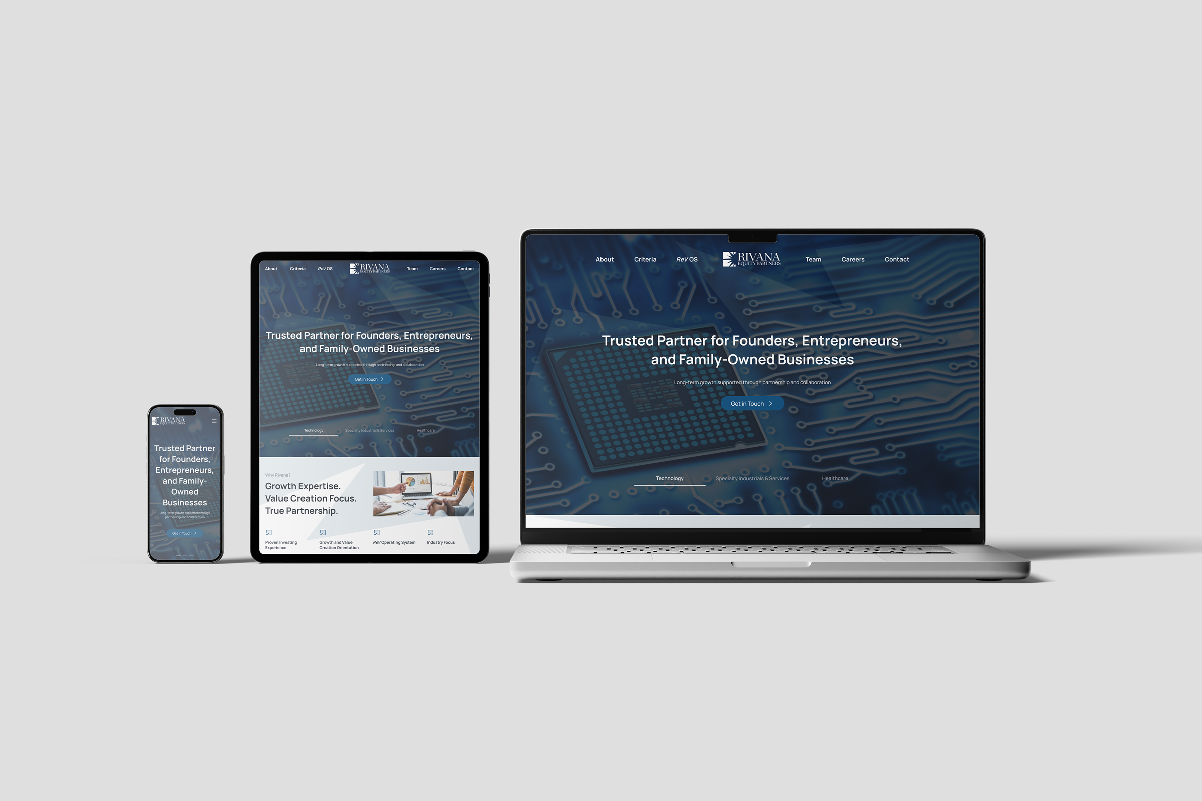
Team section as the trust anchor
Investors want to know who they're dealing with before they read about the fund's thesis. We placed the Team page high in the navigation and made partner profiles prominent — name, photo, background, and role clearly visible. This single decision shapes how the entire site feels to a first-time visitor.
Investment Criteria as a scannable checklist
Deal flow partners need to evaluate fit in under 30 seconds. Rather than long-form prose, we structured the Investment Criteria page as clear criteria blocks — sector focus, deal size, stage, and geography laid out so founders and brokers can self-qualify instantly without booking a call.
Restrained visual language over decorative design
We made a deliberate call to keep the visual design minimal — controlled whitespace, a tight color palette, and typography doing most of the heavy lifting. In private equity, over-designed websites signal the wrong things. Restraint communicates confidence.
Site Architecture
The five-page structure was designed to serve both investor and operator audiences without cluttering the navigation. Each page has a single clear job.
Design System
I built and managed the full design system in Figma, keeping scalability and handoff clarity as the primary constraints. Every component was built with all interactive states so developers had zero ambiguity.
Result
Rivana Equity launched with a website that matched the seriousness of their positioning — clean, credible, and immediately communicating who they are and what they invest in. The two-audience structure meant both investors and founders could find what they needed without friction.
The design system made the Webflow build straightforward and left the client with a site they could maintain and expand without design involvement.
The biggest challenge on this project wasn't the design itself — it was balancing two audiences with different needs in a single, uncluttered navigation. In hindsight, I'd have pushed to do lightweight user testing with both an investor and a founder before finalizing the IA. Our assumptions about how each audience navigates turned out to be mostly right, but validated data would have made those calls with more confidence.