Mastering Tech Platform
End-to-end UX/UI for a desktop learning and recruitment platform — covering discovery, program application, free resources, blog, legal, and a post-onboarding profile dashboard across 10+ screens.
The Challenge
Mastering Tech is a learning and recruitment platform designed to help aspiring tech talent discover career tracks, apply to structured rookie programs, access free learning resources, and manage their growth through a unified digital experience.
Aspiring developers and career switchers typically face three compounding problems: an unclear path from “interest” to “application,” scattered resources with weak discoverability, and low trust due to poor visibility into process, outcomes, and legal clarity. The platform needed to reduce uncertainty, increase conversion confidence, and support users after onboarding — not just before it.
I led product UX strategy, information architecture, UX writing and content hierarchy, and UI design system application across all desktop layouts. This included designing primary and secondary flows, empty and success states, modal interactions, and reusable navigation and footer patterns across 10+ screens spanning marketing, conversion, content, legal, and account areas.
Target Audience
Four distinct user types — each with different needs, intent levels, and expectations from the platform.
Fresh Graduates
Entering tech with foundational knowledge but no clear career path. Need program structure, track options, and a credible application process to feel confident moving forward.
Self-Taught Learners & Career Switchers
Motivated but skeptical. Need concrete proof of outcomes, transparent process information, and free resources to evaluate fit before committing to an application.
Existing Rookies
Already onboarded and using the platform. Need a functional account layer — resource management, settings, and profile actions — that supports their ongoing learning journey.
Partners & Collaborators
Evaluating the platform's mission and credibility for potential partnerships. Need the About and Contact experience to communicate seriousness and purpose clearly.
Key UX Decisions
Persistent cohort timeline in the announcement bar
A recurring announcement bar keeps application and onboarding dates visible across all pages — Applications open: 09/01/2026, Onboarding starts: 01/03/2026. Deadline visibility is one of the strongest conversion drivers for program-based products. Hiding it in one section means most users never see it at the moment it matters.
Clear CTA hierarchy with consistent wording
Primary actions — Apply Now, Download Brochure, Discover More, Add Resource — use consistent wording and placement across pages. Inconsistent CTA language forces users to re-evaluate their next step on every new screen. Repetition builds momentum toward conversion rather than creating decision fatigue.
Trust through transparency — legal and company pages
About, Contact, and Privacy Policy were treated as trust infrastructure, not filler. Career switchers and fresh graduates applying for structured programs need to verify the organization's legitimacy before submitting personal information. Structured legal content and a clear company narrative directly reduce hesitation before conversion.
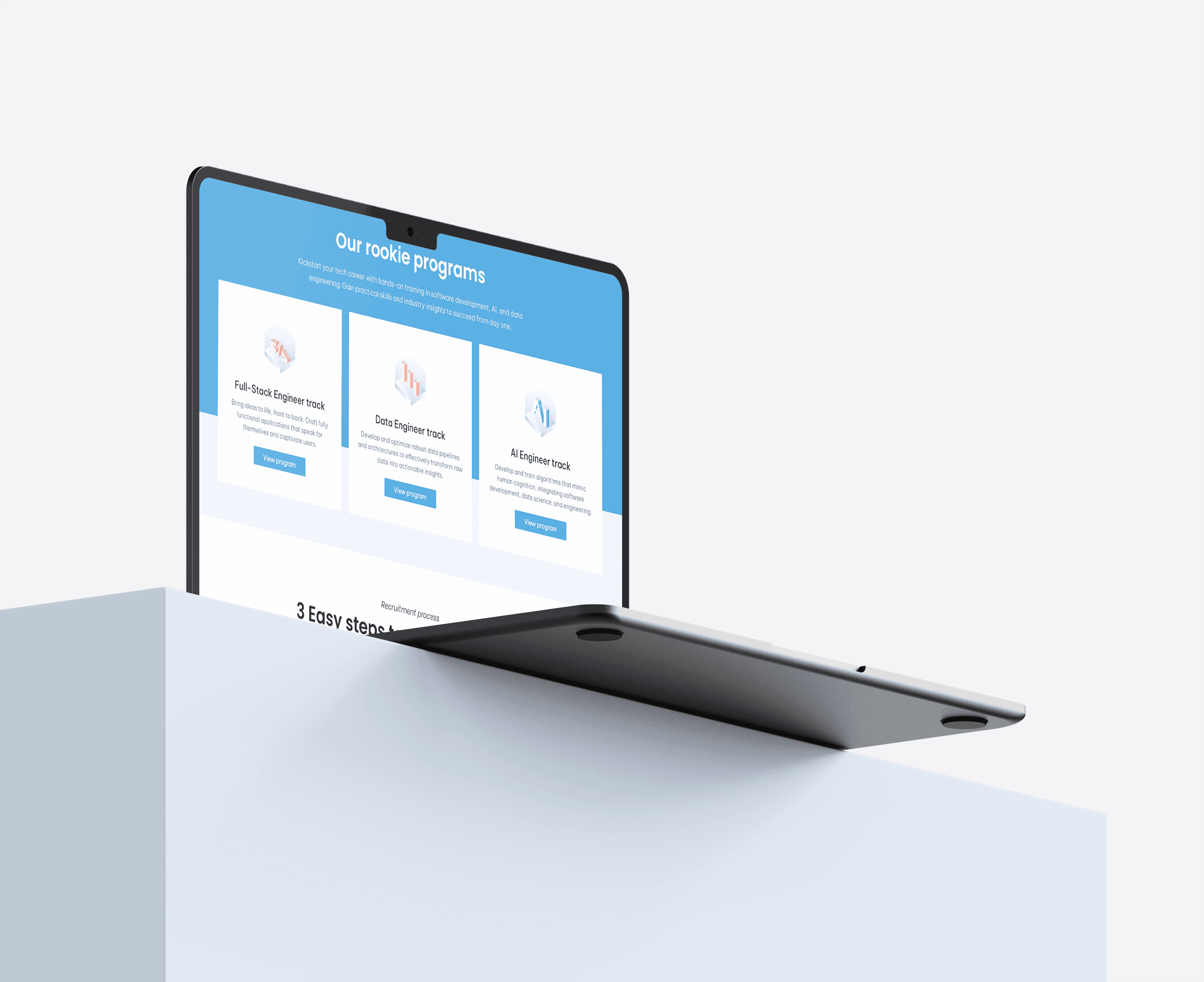
Content discoverability via filters, search, and pagination
Free Resources and Blog include topic/category segmentation, search, sort affordances, and pagination. Learners don't convert from a wall of content — they convert when they can quickly find what's relevant to their track interest. Discoverability is the difference between a resource library and a content archive.
Intentional empty and success states
Two edge-case states were explicitly designed: a Blog empty state ("No articles available yet" + back-home CTA) and a Contact success state ("Your message has been sent!"). Undesigned empty and error states are where user trust collapses. Explicit handling of these moments keeps users oriented and reassured rather than abandoned.
Information Architecture
The experience is organized into five product layers — each serving a distinct phase of the user journey from first discovery through post-onboarding account management.
Design System
A consistent component system was built across all 10+ screens to support multi-template continuity, state-driven variants, and low cognitive load across very different page types — from marketing to legal to account management.
Result
The platform delivers end-to-end continuity from first discovery through active account use — a cohesive desktop experience where every screen has a clear job and hands off cleanly to the next. Conversion architecture (persistent timeline, repeated CTAs, trust-building pages) works alongside content utility (filtered resources, searchable blog) to serve users at different intent levels simultaneously.
Explicit empty and success states mean the product handles edge cases with confidence rather than leaving users stranded — a detail that separates a polished product from a prototype.
The hardest challenge here was maintaining coherence across 10+ screens that serve fundamentally different purposes — a homepage optimized for emotional resonance sits in the same system as a privacy policy optimized for legal clarity and a dashboard optimized for task completion. The shared navigation, footer, and typographic system carried the consistency, but it required constant discipline to keep each screen focused on its job rather than bleeding in patterns from adjacent screens. Next, I'd add personalized resource recommendations based on track interest and a lightweight progress tracker in the profile dashboard — the account layer is where long-term retention is won or lost.