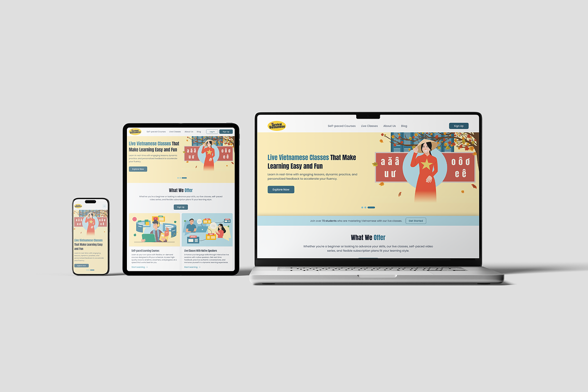
Survival Vietnamese Website
Designed an end-to-end learning experience for a Vietnamese language platform — combining self-paced courses, live classes, blog content, and checkout into one cohesive, conversion-ready product.
The Challenge
Survival Vietnamese is a learning platform that helps users speak Vietnamese confidently through two formats: self-paced courses and live classes. The product combines language lessons, cultural context, community engagement, blog content, and checkout flows into one end-to-end experience.
Many learners struggle to find Vietnamese programs that are practical, culturally grounded, and flexible for different schedules and confidence levels. Existing options often separate learning content, class booking, and payment into disconnected experiences — making the path from interest to enrollment unnecessarily difficult.
I collaborated with two designers who handled screen-level UI execution. My focus was on building the foundation: design system setup, interactive prototyping, responsive standards, iteration support during client feedback sessions, and pre-launch QA across usability, consistency, and responsiveness.
Target Users
The platform serves learners at four distinct stages, each with different motivations and content needs.
Complete Beginners
Need foundational Vietnamese for daily life. Motivated by practicality — want real phrases they can use immediately, not academic grammar.
Heritage Learners
Understand spoken Vietnamese but need reading and writing confidence. Culturally connected but formally undertrained.
Intermediate Learners
Seek stronger conversation skills. Have a foundation but want fluency in real-world exchanges, not just textbook scenarios.
Advanced Learners
Refining storytelling and vocabulary in complex discussions. Need nuance, not basics — cultural depth and edge cases matter here.
Key UX Decisions
Consistent top navigation across all pages
With 8 distinct pages serving different audience intents, orientation consistency was critical. A persistent top nav kept users from getting lost between content discovery (Blog), trust validation (About), and purchase (Checkout).
Quiz-like level prompts to reduce decision fatigue
"Not Sure Which Course is Right for You?" and "Need Help Choosing a Live Class?" guided undecided learners into the right format without overwhelming them with a full course catalogue. Self-selection friction was the biggest barrier between interest and enrollment.
Course cards expose high-value metadata early
Price, lesson count, duration, and quiz count were surfaced directly on course cards — before the user clicks into a detail page. This front-loading of decision-relevant data respects the learner's time and reduces unnecessary navigation.
Layered trust stack before checkout
Trust was built across four layers: team and instructor bios (credibility), student testimonials (social proof), FAQ (objection handling), and a 14-day money-back guarantee (risk removal). Each layer addressed a different reason a purchase-ready user might hesitate.
Checkout with legal clarity and refund reassurance
The checkout page included refund policy visibility, secure payment messaging, and a clear order summary — not just a payment form. For an online course purchase, cart abandonment most often happens not from price resistance but from last-second trust uncertainty.
Information Architecture
Eight pages, each with a single clear job in the learning journey — from first discovery to post-purchase reassurance.
Design System
A scalable design system was established in Figma before any page-level work began — covering typography, color, spacing, and components. Interactive prototypes were built to communicate flows to stakeholders and give developers a clear implementation reference.
Result
The experience was designed to move users from curiosity to confidence by combining clear program differentiation, practical learning outcomes, cultural authenticity, and low-friction checkout. Every page in the funnel had a defined job — and the design system kept those pages coherent without being repetitive.
The layered trust model (team stories → testimonials → FAQ → guarantee) addressed every major reason a potential learner might hesitate before purchase, reducing the emotional distance between interest and enrollment.
The most interesting design challenge here wasn't any single screen — it was serving four learner types (beginner, heritage, intermediate, advanced) within a single IA without creating a maze. The quiz-style self-selection prompts were the right call, but I'd push harder next time to validate those decision points with actual learners before finalizing the flow. Assumptions about how people self-identify their language level turned out to be trickier than expected.